Better Cotton is the world’s leading sustainability initiative for cotton. Our mission is to help cotton communities survive and thrive, while protecting and restoring the environment.
In just over 10 years we have become the world’s largest cotton sustainability programme. Our mission: to help cotton communities survive and thrive, while protecting and restoring the environment.
Better Cotton is grown in 22 countries around the world and accounts for 22% of global cotton production. In the 2022-23 cotton season, 2.13 million licensed Better Cotton Farmers grew 5.47 million tonnes of Better Cotton.
Today Better Cotton has more than 2,700 members, reflecting the breadth and diversity of the industry. Members of a global community that understands the mutual benefits of sustainable cotton farming. The moment you join, you become part of this too.
The founding premise of Better Cotton is that a healthy sustainable future for cotton and the people that farm it is in the interests of everyone connected with it.
Let us help you find what you’re looking for
Results for {phrase} ({results_count} of {results_count_total})
Displaying {results_count} results of {results_count_total}
Recently, Cotton Australia, a partner of Better Cotton, launched a new data dashboard, allowing Australian cotton farmers to transparently report data in order to measure progress and drive farm-level change. The dashboard will also give retailers, brands and other members of the supply chain access to accurate, up-to-date information, allowing them to make decisions about Australian cotton as a fibre of choice.
For the third instalment of our Data & Impact series, we sat down with Brooke Summers, Supply Chain Consultant at Cotton Australia and the coordinator of the data dashboard project, to talk about how the programme came about, the key challenges, and what other cotton producers can learn about impact data from Cotton Australia’s initiative.
Photo credit: Brooke Summers
Could you tell us a bit about your background and your role at Cotton Australia?
I’ve been working with Cotton Australia for over 20 years, mainly in communications and marketing. For the last ten years, I’ve been leading the ‘Cotton to Market Strategy’, which is all about engaging with our customers throughout the supply chain. That includes brands, retailers, global not-for-profit organisations, textile associations and anyone who’s influencing the way our customers think about raw materials.
Could you tell us about your data dashboards project, how it came about, and what the aims were initially?
The idea for the project came about through conversations we were having with our brand and retail partners and customers around the need for data, and specifically transparent impact data. So, it came from customer need, but we also felt as an industry that we had been collecting a lot of information over a long period of time, yet there wasn’t really a single source of truth for that information.
Different organisations within the industry were reporting or collecting numbers in different ways, and we were all getting lots of enquiries from people wanting more information. Rather than duplicating work, we thought it would be a great idea to build a platform where we could agree on which metrics we wanted to report, which source of truth we were going to use, and who would be responsible for keeping that information up to date.
How did you make those decisions about what data to collect?
I put together a little working group with the key data holders in the industry, and we looked at all the metrics we were collecting on a regular basis as part of our sustainability targets and other reporting requirements. We did a big scan and condensed that into a data map with a number of pillars, following our ‘Planet. People. Paddock.’ sustainability framework and adding a few extra pillars, such as ‘Product’, ‘Projects’ and ‘Practices’.
The hardest part of the project was getting everybody to agree on what we wanted to report, and specifically how we were going to report it. For example, there are probably ten different ways you can calculate water use efficiency, so we needed to decide which was the best way for that particular audience. We wanted to be very transparent and open about what we were reporting, how we calculated it and how we’d come to those decisions.
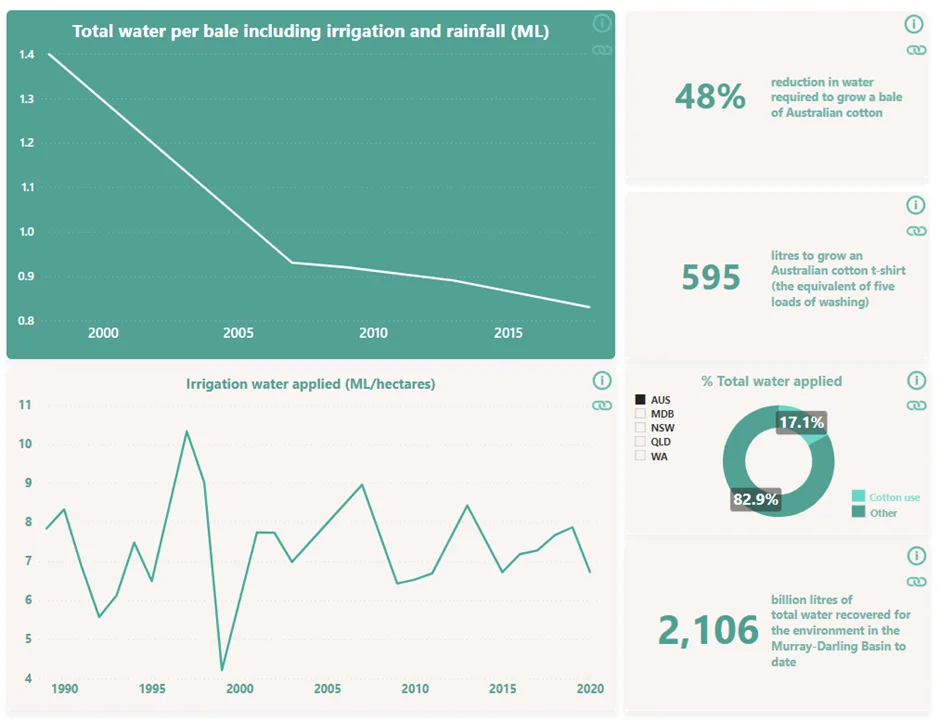
Photo credit: Cotton Australia. Description: An example of Cotton Australia’s data dashboard, highlighting statistics on water use.
How difficult was it to get the project off the ground?
We’re lucky in some ways that we’ve got a relatively small industry here in Australia – there are around 1,500 farmers. Unlike a lot of other cotton-producing countries, it’s easy for us to get organised, and all the industry organisations are very collaborative. There was no trouble at all getting people to participate – everyone was happy to put their data on the table and have it shared in this way.
The farmers that we’ve spoken to so far have just been blown away by the project. We’ve got lots of farmers on our board and I think they can really see the value in having all this information in one place for the first time.
However, it did take time to get everything together in the right formats, because there were over 70 metrics that we were reporting on the dashboard, so we worked with the developers to make sure what we were reporting was coming to life in a way that made sense to the user.
What lessons have you learned from this project?
Traditionally, we’ve collected data because it has made good business sense, it has helped us make better decisions on the farm to drive efficiencies and innovation. Now there’s a new driver for data collection which is about market access and reporting impact. At the moment, our farmers are paying for this through a compulsory levy to our Cotton Research and Development Corporation, which is matched by the Australian Government.
So I think that it’s important for brands to think about the demands they’re making around impact data. I think sometimes they don’t understand how difficult, expensive and time-consuming it is to collect granular information from farmers. It’s crucial that brands engage directly with organisations like ours to understand what these demands really mean, and that they provide value to the farmers creating the sustainability impact.
To find out more about Cotton Australia’s data dashboard, head to this link.
Newsletter sign-up
Do you want to know what the largest cotton sustainability programme in the world is up to? Keep up to date with the latest developments and hear from BCI Farmers, Partners and Members in the new BCI Quarterly Newsletter. BCI Members also receive a Monthly Member Update.
Leave a few details below and you’ll receive the next newsletter.
We’ve updated our Data Privacy Policy
These updates are intended to reflect changes to the Better Cotton Platform’s default sharing settings and data use in our Audit management system.
You don’t need to do anything to accept these changes – they’re effective from today, 2 April 2025.
You can read the full text by visiting our Data Privacy Policy page.